


News about maps
Digital cartography and GPS navigation
Mapstor news
This Day in History
Travelling with mapstor.com
Digital cartography and GPS navigation
115 years of flight
Next-generation of GPS satellites are headed to space
DJI Phantom 4 RTK - cartography of a new generation
Earthquake prediction systems
OneSoil map
The illusions of brain. Map projections
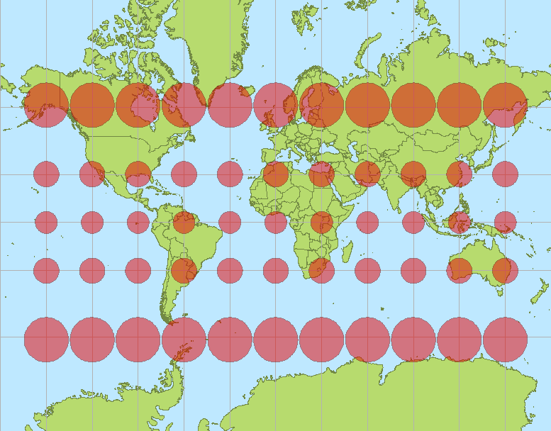
Distortions of space in Mercator
In fact, Africa is larger in area than the US, China, India and almost the whole of Europe put together. But from generally accepted projections of maps develops an illusion that it is not like this. The so-called Mercator projection, which is used for many maps, strongly distortes area closer to the poles. Small Greenland (the area of which is less than the Congo) seems to have a gigantic territory. Antarctica too. The area of Russia is exaggerated in comparison with the southern countries. Or take the Ukraine, the area of which is actually equal to the area of Madagascar.
All maps of the world are lying to us for many centuries. Moreover, in different countries - Russia, Europe, USA, China, Australia, Chile, South Africa - maps of the world are very different.
Distortions in cartographic maps - is a natural phenomenon, because the cartographers need to make the unfolding of the ellipsoid of the Earth on a plane. It is in principle impossible without distortion. The only question is what it can distort, and what not.
Distortions can be of four types:
length distortion;
angle distortion;
space distortion;
forms distortion.
Generally accepted Mercator projection was invented by Flemish cartographer and geographer Gerard Mercator in 1569 and is still used as a standard map projection in marine navigation, because it virtually eliminates the distortion angle. It allows you to determine the correct azimuth and direction. Going in the right direction – this is the most vital in navigation. The trajectory of the ship motion, coming under the same meridian to the rumba, on the map is represented by a straight line in the Mercator projection.
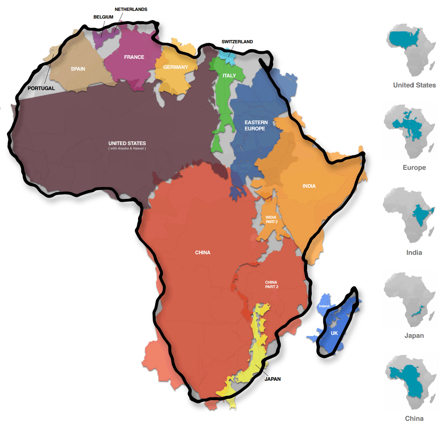
The true size of Africa in comparison with other countries. Maps Author: Kai Krause
Why most people did not realize the true scale of the giant of Africa or the modest size of Russia, Canada and Greenland? Because for some reason, the Mercator projection is not only used in marine navigation, but also in many other maps. By these maps are taught in schools, such maps are shown on TV. Hence appears the characteristic cognitive distortion among many citizens.
The main thing is that we do not necessarily use Mercator projection in everyday life. We are not sea navigators and do not plan air raids on neighboring countries, where you have to fly in a straight line. We are ordinary civilians. Why do we need exact direction in a straight line between geographical points?
Why, then, Mercator maps are used in school, on TV, etc.? It is not entirely clear. Perhaps, for the modern people still more important to understand the relative sizes of the world, rather than to determine the direct route guidance.
As we have seen the Mercator projection shows only real area near the equator and all other areas of the globe are very distorted. These distortions - the price that we pay for the knowledge of the exact directions for navigation.
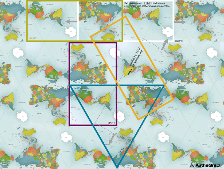
How can we create a more accurate and fair map of the world with the least distortion of space? In 2009 the designers of the company AuthaGraph we tried to solve this problem. Their work consists in the use of geometric modeling ideas in practical problems. One of these tasks - designing a visual map of the world. Then they made AuthaGraph World Map that displays the most equitable geographical area of countries and territories.
Here is used the variation of the so-called perspective projection in which a three-dimensional object displays the same distortion ratio (length of the segment projected on a plane parallel to the reference axis, to the actual length of the segment) on all three axes.
The projection is made in several stages. First elliptical surface of the globe is divided into 96 equal triangles. They are projected onto the 96 regions of the modified tetrahedron. Then tetrahedron "flattened" to the proper shape and is cut so that it can be deployed in a rectangular shape that is flat in a standard rectangular map of a usual form.
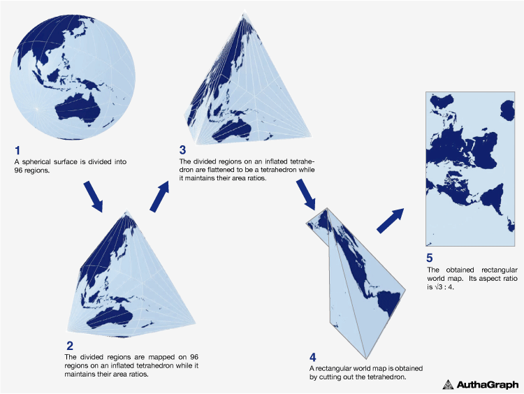
Phases of AuthaGraph World Map compilation
Of course, you can immediately projected the sphere on tetrahedron by conventional optical means, but there are strong distortions that are evident. The idea of the pre-partition into 96 regions was designed to minimize such distortions and to maintain the proportions of areas relative to each other.
But there is no limit to perfection. On the basis of the original AuthaGraph map Japanese designer Hajime Wristbands (Hajime Narukawa) has created a new version that looks great and still retains the same proportions of countries and continents relative to each other, as well as the ratio of the mass of the earth and the oceans.
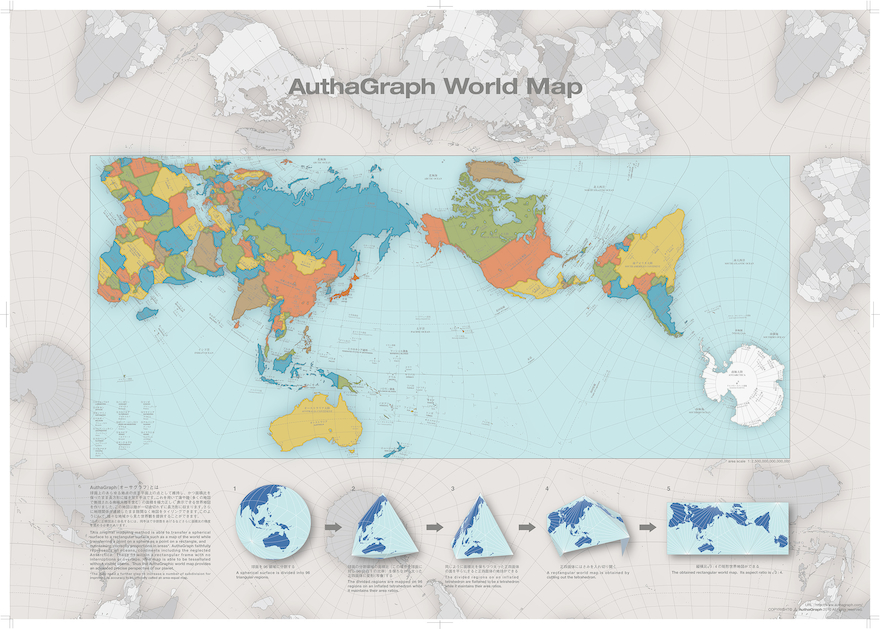
Hajime Wristbands Map based on AuthaGraph World Map
This more equitable and proportional map can be used in school textbooks and in the media, because it more accurately shows a plane projection of the globe and gives a better idea of how our Earth looks like. Its advantage is the fact that all continents are shown on the map without breaks, including Antarctica.
All existing maps have a distortion. Only a globe gives the most accurate picture of the world. But if we have to use a flat surface, then at least try to minimize the amount of distortion.
Digital cartography and GPS navigation 05-02-2017