


News about maps
Digital cartography and GPS navigation
Mapstor news
This Day in History
Travelling with mapstor.com
Digital cartography and GPS navigation
115 years of flight
Next-generation of GPS satellites are headed to space
DJI Phantom 4 RTK - cartography of a new generation
Earthquake prediction systems
OneSoil map
What maps reveales about ourselves
Cartography has produced beautiful works of art – but are they as objective as we think? Alastair Sooke explores the unreliable history of map-making.
As a boy, like many others, I used to love scrutinising maps. My family spent the summer holidays beside the coast in Dorset, in southern England, and on the wall of the cottage where we stayed there was a large framed sheet of an Ordnance Survey map from 1963, charting the surrounding area at a scale of six inches to one mile.
Whenever it rained – which, since this was summertime in Britain, was dispiritingly often – I would study this black-and-white plan, marvelling at its complex system of marks and symbols.
Even today, when I go for a long walk in the countryside, I still like to pack an OS Explorer map. It’s more reliable than, say, an app on my smartphone, which is prone to running out of power, or losing its signal.
This is the thing about maps: properly produced, they feel objective and authoritative – scientific tools that allow us to orient ourselves within the world. Indeed, the Ordnance Survey, Britain’s famous mapping agency, still prides itself on being as comprehensive and accurate as possible.
The Dauphin Map of the World (Credit: Credit: Ivy Close Images / Alamy)
The Dauphin Map of the World is best understood as a beautiful work of art rather than a faithful reflection of the terrain (Credit: Ivy Close Images / Alamy)
Today it has evolved into a digital powerhouse maintaining an enormous database of geospatial information. All of its maps are produced from its so-called ’OS MasterMap’ of Great Britain, which contains more than 460 million geographic features and is continually updated – astonishingly, more than 10,000 times a day – by a team of 270 surveyors using GPS technology.
“We survey to centimetre accuracy,” explains OS sector manager Elaine Owen, who also points out that the MasterMap is the source for much of the data provided via satnavs. “Our mapping database is the most detailed and sophisticated geospatial database in the world.”
Skewed perspectives
Yet a new book, Map: Exploring the World, published by Phaidon later this month, suggests that maps aren’t necessarily as trustworthy or objective as we tend to assume. This is certainly the case when we consider historical maps, many of which are beautiful works of art but which often reveal more about their cartographers than the domains they supposedly document.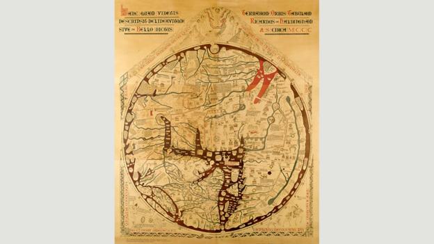
Mappa mundi from Hereford Cathedral (Credit: Credit: Hereford Cathedral/Corbis)
Medieval world maps like the mappa mundi from Hereford Cathedral placed Jerusalem at the centre of the design (Credit: Hereford Cathedral/Corbis)
Medieval world maps, for instance, commonly placed Jerusalem at the centre of the design – reflecting the spiritual importance of Christianity during that era. The celebrated mappa mundi of c1300 from Hereford Cathedral offers a classic example of this trend.
The surveyor William Smith’s exquisite map of the geological make-up of England, Scotland and Wales from 1815, by contrast, was motivated by a very different impulse. After decades of excavation, Smith was sceptical about religious explanations for differing rock strata and fossils, so he felt compelled to produce the world’s first geological map of a country. Delineating rock layers using 20 hand-painted tints, his map presaged the way in which science would challenge fundamental tenets of Christianity during the 19th Century.
There are countless examples of maps that are redolent of particular cultures, such as the stick charts of the Marshall Islands of the South Pacific. Made by binding shells to sticks using palm fibre, these record the locations of islands, currents and ocean swells.
Then there is the Chukchi Sealskin Map of c1870, now in the Pitt Rivers Museum in Oxford. This is a kind of encyclopaedia of a way of life as much as a map: its pictographs of, among other things, walruses, whaling schooners, kayaks and shamans present hunting scenes and moments of daily village routine, documenting the pastimes of the people of the Chukchi Peninsula in north-east Asia, across the Bering Strait from Alaska.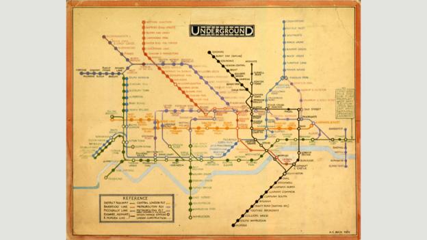
Harry Beck’s streamlined 1931 map of the London Underground (Credit: Credit: TfL from the London Transport Museum collection)
Harry Beck’s streamlined 1931 map of the London Underground echoes the era’s hunger for innovative modernity (Credit: TfL from the London Transport Museum collection)
Harry Beck’s streamlined 1933 map of the London Underground, meanwhile, offers a quintessential expression of the appetite for innovative modernity in Britain in the early 20th Century. This was also the moment when the hitherto stuffy Ordnance Survey began to loosen up: “It wasn’t until the interwar period, in the first half of the 20th Century, that the OS became truly entrenched in the public imagination – and affection – as synonymous with hiking,” explains Rachel Hewitt, author of Map of a Nation: A Biography of the Ordnance Survey. “This was due to its production of easily portable, beautiful paper maps that tapped into the cultural craze for exploration of the British landscape.”
‘The final frontier’
Today’s dynamic mapmakers are less concerned with distance and material objects: instead, they chronicle networks and connectivity, including the real-time, global use of social media such as Twitter and Facebook, shifting second by second. In doing so, like myriad charts before them, these new maps reflect the preoccupations of the era that produced them – in their case, the ‘Information Age.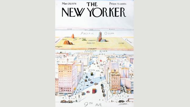
The View of The World from 9th Avenue by Saul Steinberg (Credit: Credit: Saul Steinberg/New Yorker)
The View of The World from 9th Avenue by Saul Steinberg is a ‘map’ that gives absurd prominence to Manhattan (Credit: Saul Steinberg/New Yorker)
Occasionally the inherently skewed perspective of maps is something that artists have lampooned. Saul Steinberg’s View of the World from 9th Avenue, which appeared on the cover of the New Yorker magazine in 1976, is an infamous ‘map’ in which absurd prominence is given to Manhattan in the foreground, while the background, consisting of vast tracts of terrain heading west from the Hudson River all the way to the Pacific Ocean and beyond, is sketchy in the extreme: Mexico and Canada, for example, are nothing but tiny patches of blank space to left and right. Steinberg was making a joke about how narrow our individual perspectives on the world can be.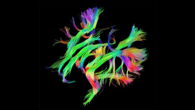
The Human Connectome Project that shows the white-matter networks in our brains (Credit: Credit: www.humanconnectomeproject.org)
The Human Connectome Project that shows the white-matter networks in our brains has been described as ‘the final frontier’ in cartography (Credit: www.humanconnectomeproject.org)
That said, many experts now agree that we are living in a golden age of cartography. “My favourite maps are those being produced by the Human Connectome Project that show the white-matter networks in our brains,” says John Hessler, a specialist in modern cartography at the Library of Congress in Washington, DC, who has written the introduction to the new Phaidon book.
“These are the highways and electrical lines that connect the more well-known grey-matter thinking and acting bits. For me, these show something of the final frontier of cartography – the ultimate mapping of ourselves – and represent a mapping project unlike any other in human history.”
Digital cartography and GPS navigation 25-11-2015